

Think about the last time a brand stopped you in your tracks. Maybe it was the packaging on a product, a social media post that looked immediately recognisable, or a website that just felt right from the first second. You probably couldn’t explain exactly why it worked. You just knew it did.
That feeling isn’t accident. It’s the result of deliberate visual identity.
Visual identity is the sum of all the visual decisions a business makes – and it communicates something about your company before a single word is read. Customers form an impression of your brand in milliseconds. That impression is shaped almost entirely by what they see.
The good news: you don’t need a large budget or a full-time designer to build a strong visual identity. You need to understand the six elements that make it up, make intentional decisions about each one, and apply them consistently.
What Is Visual Identity – and What It Isn’t
Visual identity is the collection of visual elements that represent your brand: your logo, colours, typography, imagery, graphic style, and how these elements are applied across all your materials.
It is not the same as your brand identity, which is broader and includes your values, personality, tone of voice, and positioning. Visual identity is the visible expression of brand identity – the part people can actually see.
And it’s not just about looking nice. Visual identity does specific work:
- It creates recognition – people can identify your brand without reading the name
- It communicates values – colours, shapes, and type choices carry meaning
- It builds trust – consistency signals stability and professionalism
- It creates differentiation – your brand looks like yours, not like everyone else’s
A business with no deliberate visual identity still has one – it’s just inconsistent, accidental, and probably undermining the trust you’re trying to build.
Element 1: Logo
The logo is the anchor of your visual identity. Everything else builds around it.
A strong logo doesn’t need to be clever or complex. It needs to be clear, distinctive, and versatile enough to work in different sizes and contexts – on a website, a business card, a social media profile, an invoice, and potentially a sign or a shirt.
The types of logos:
- Wordmark – your company name in a distinctive typeface (think: Google, FedEx)
- Lettermark – initials only (IBM, HBO)
- Symbol/icon – a standalone graphic (Apple, Nike)
- Combination mark – symbol and wordmark together (most small businesses)
For most small businesses, a combination mark or a wordmark is the right starting point. They’re versatile, they communicate the business name directly, and they scale well.
What your logo system needs: You shouldn’t have just one version of your logo. You need at minimum:
- Full-colour version on a light background
- Full-colour version on a dark background
- Single-colour black version
- Single-colour white version
Having all four means you’re never in a situation where your logo clashes with a background or disappears. This is a detail that separates businesses with considered visual identities from those without.
Element 2: Colour Palette
Colour is the visual element with the most immediate emotional impact. Before someone reads a word, colour has already communicated something – energy or calm, premium or accessible, traditional or modern.
Colour choices aren’t arbitrary. Blue communicates trust and reliability (banks, healthcare, tech). Green communicates nature, health, and growth. Orange communicates energy, warmth, and approachability. Black communicates luxury, precision, and authority. These associations aren’t universal rules – they’re starting points that context and execution shape further.
Building a small business colour palette:
You need four categories:
Primary colour – the dominant brand colour. Used on your logo, key headings, and primary visual elements. This is the colour people associate with your brand.
Secondary colour(s) – one or two colours that complement the primary. Used to add variety, create contrast, and prevent materials from looking monotonous.
Neutral colours – backgrounds, body text, supporting elements. Off-whites, light greys, dark greys, near-blacks. These give the eye somewhere to rest and make the primary and secondary colours stand out.
Accent colour – optional, used sparingly. Often a contrast colour used for calls to action, highlights, or special elements. Should be used with restraint – once it’s everywhere, it loses its function.
The technical part people skip: For every colour in your palette, record the exact code in three formats – HEX (for digital design and web), RGB (for screen use), and CMYK (for print). Without these, your designer, your printer, and your website will all show slightly different versions of your brand colour, and the inconsistency quietly erodes professionalism.
Element 3: Typography
Typography is one of the most underestimated elements of visual identity. Most people don’t consciously notice font choices – but they absolutely feel them. A modern sans-serif reads differently from a traditional serif. A geometric typeface signals something different from a humanist one.
And beyond feel, typography creates hierarchy. It tells the reader what to read first, what’s most important, and how to navigate a page or a document.
The two-font system:
For almost all small businesses, two fonts is the right number.
Display/headline font – used for headings, titles, and large text. This font carries more personality and visual weight. It can be more distinctive, more expressive, more unusual.
Body font – used for paragraphs, captions, and long-form text. This font prioritises legibility above everything else. It should be easy to read at small sizes for extended periods.
The two should contrast without clashing. A bold, distinctive headline font with a clean, neutral body font is the most reliable combination.
Practical guidance: Google Fonts has hundreds of high-quality free fonts. For small businesses, the combination of a Syne, Playfair Display, or similar expressive headline font with a neutral body font like DM Sans, Inter, or Open Sans works reliably across most contexts.
Document your chosen fonts with the specific weight(s) you use (regular, medium, bold), and approximate size rules for headings versus body text. This ensures consistency whether your content is created in Canva, by a designer in Figma, or in a Word document.
Element 4: Imagery Style
The photos and visuals you use are part of your visual identity just as much as your logo is. And this is the element most small businesses leave to chance.
Stock photos are everywhere, and they look like everywhere. When every business uses the same category of generic office photography, no brand stands out. Defining your imagery style is how you make visual content that actually looks like yours.
Questions that define your imagery style:
Mood: Are your images bright and airy, or dark and moody? Warm and inviting, or cool and clinical?
Subject: Do your images feature people, products, environments, abstract concepts – or a combination?
People, if applicable: Are they posed and polished, or caught in natural action? Do they look at the camera or away? Are they diverse in a way that reflects your actual customers?
Colour treatment: Do images have a warm, yellow-toned feel? Cool and desaturated? High contrast? Soft and muted? Even if you don’t apply a literal filter, choosing images that share a colour temperature creates visual coherence.
Authentic vs. produced: Some brands are built on authenticity – real people, real environments, genuine moments. Others are built on precision and production value – every image carefully composed and lit. Neither is right or wrong. What matters is consistency and fit with your brand personality.
A practical method: Create a visual reference board (Pinterest, Milanote, or simply a folder of saved images) of 10–15 photos that feel right for your brand. Look at what they have in common. Write it down. That’s your imagery guide.
Element 5: Graphic Style
Beyond photos, most brands use graphic elements – icons, shapes, patterns, dividers, backgrounds, illustration styles. These supporting elements are part of visual identity too, and they deserve the same intentional decisions.
Shapes and geometry: Rounded corners communicate softness, approachability, and friendliness. Sharp corners communicate precision, strength, and authority. Organic shapes communicate creativity and naturalness. Geometric shapes communicate order and reliability. Your brand’s graphic language should be consistent with the personality you’re projecting.
Icons: If you use icons in your materials, they should have a consistent style – line thickness, corner style, level of detail. Mixing a flat icon with a 3D icon with a hand-drawn icon in the same document looks accidental.
Patterns and textures: Optional, but powerful when used well. A brand that uses a consistent repeating pattern or texture across its materials becomes immediately recognisable. Think of it as visual wallpaper – it fills space and builds atmosphere without demanding attention.
White space: Technically the absence of graphic elements, but perhaps the most important graphic decision. Brands that use generous white space feel premium, calm, and confident. Brands that crowd every surface with elements feel cheap and anxious. White space is a deliberate choice, not leftover space.
Element 6: Consistency of Application
The sixth element isn’t a visual component – it’s what makes all the others work.
The strongest logo in the world, paired with a perfect colour palette, brilliant typography, and a clear imagery guide, will still fail to build brand recognition if none of it is applied consistently. Recognition comes from repetition. Repetition requires consistency.
Consistency means:
- The same logo version in the same position across all your social media profiles
- The same colour HEX codes used in every digital asset
- The same fonts in every document, presentation, and email signature
- Photos that look like they come from the same brand world
- A visual rhythm across your feed, your website, and your printed materials that makes everything feel related
The tool that makes consistency possible: A brand book. It’s the single document that captures all five elements above and tells anyone who touches your brand exactly how to use them. Without it, consistency depends entirely on memory – and memory is unreliable.
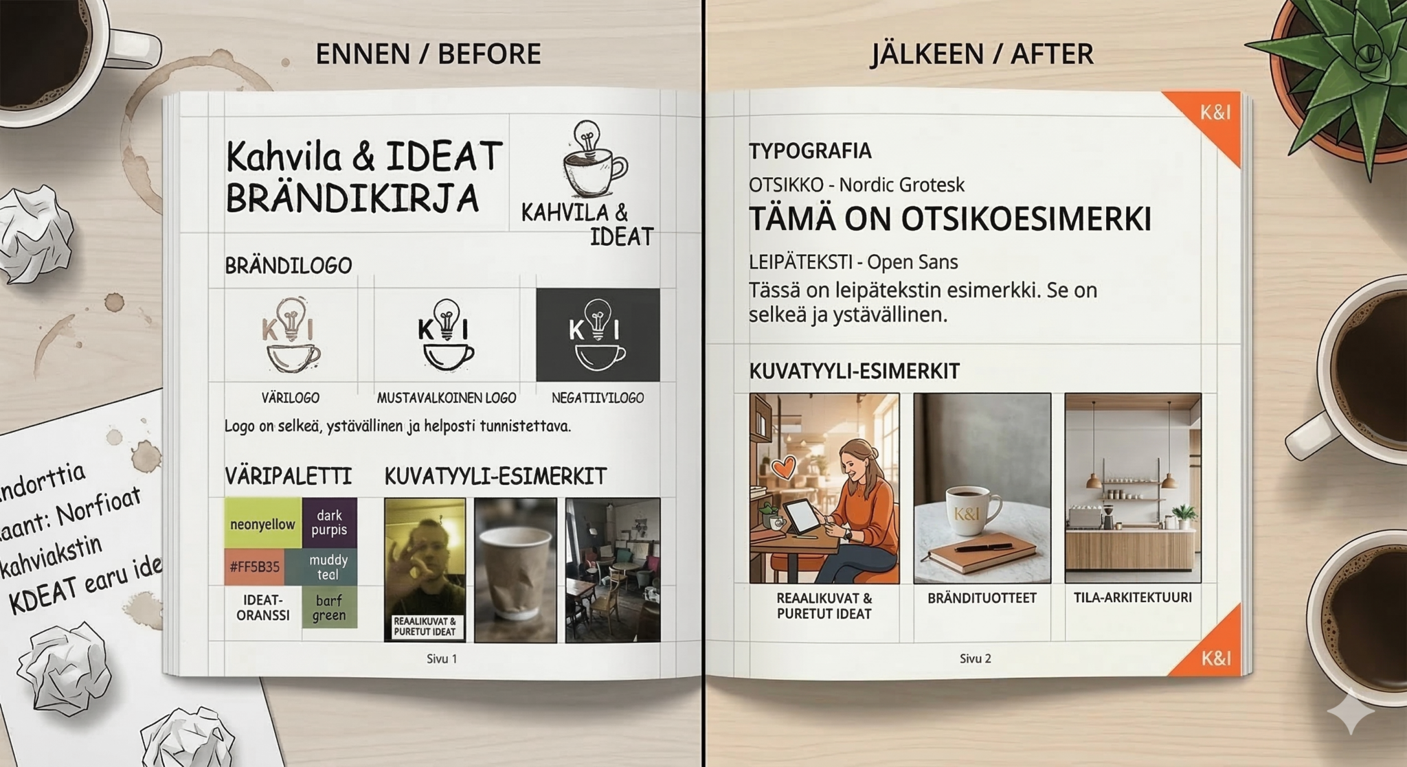
Before and After: What the Difference Looks Like
Without deliberate visual identity: A small consultancy has a logo made in Canva three years ago. Their website uses a blue that’s slightly different from the blue in the logo. Their LinkedIn banner uses a stock photo that doesn’t look anything like their website. Their proposals are in a Word template with default Times New Roman. Their email signature has yet another version of their logo, resized badly and slightly blurry.
Every element is technically functional. But the overall impression is: unpolished, inconsistent, and slightly uncertain. It quietly undermines the credibility they’re working to build.
With deliberate visual identity: The same consultancy defines four brand colours, picks two fonts, documents their logo properly in four versions, creates a Canva template that uses all of the above, and uses the same hero image style across their website and social media.
Nothing about this required significant budget. It required two evenings of focused work and a bit of documentation. The result: every touchpoint now reinforces the same impression – clear, professional, and trustworthy.
Building Your Visual Identity With Target
Visual identity decisions don’t exist in isolation. They connect directly to your brand strategy, your marketing positioning, and how you communicate with customers every day.
Target brings your brand guidelines – including all six visual identity elements – into the same place as your marketing strategy and content planning. When everything is connected, consistency stops being a goal and starts being the default.
Join the waitlist – build your visual identity among the first →
Frequently Asked Questions
What is visual identity in business? Visual identity is the complete set of visual elements that represent your brand – including your logo, colour palette, typography, imagery style, and graphic language. Together, these elements create a consistent and recognisable appearance across all your materials and channels.
What is the difference between visual identity and brand identity? Brand identity is the full picture of your brand – your values, personality, positioning, tone of voice, and visual elements. Visual identity is the visible part of brand identity: everything customers can see. A strong brand identity needs both the visual and the verbal dimensions working together.
What is the difference between visual identity and a logo? A logo is one element of visual identity. Visual identity is the complete system: logo, colours, typography, imagery, graphic style, and the rules for how they’re used together. A logo alone cannot create the consistency and recognition that a full visual identity system delivers.
How many colours should a small business use? Three to five colours is the practical range for most small businesses: one primary brand colour, one or two secondary colours, one or two neutral colours, and optionally an accent colour. More than five colours typically creates inconsistency; fewer than three can feel flat in execution.
Do you need a designer to build a visual identity? Not necessarily. If you’re starting from scratch, a designer is valuable for creating a logo and making initial colour and typography decisions. But the application and documentation of your visual identity – the brand book, the templates, the consistency – is work that any organised business owner can do. Tools like Canva, Google Fonts, and Coolors make the practical parts accessible without design expertise.
How do you maintain visual identity consistency? The most reliable method is a brand book – a document that defines your visual identity rules and is accessible to everyone who creates content for your brand. Beyond that: use templates for recurring formats (social posts, presentations, documents), save your exact colour codes somewhere central, and review your materials periodically to catch drift before it becomes habit.